


Elevate your brand with BigSigns.com's unparalleled expertise, premium products, and unmatched customer service. We are best in class for printing all of your facility branding products.

Collection: Products
Select a product
Amplify Your Brand with BigSigns.com
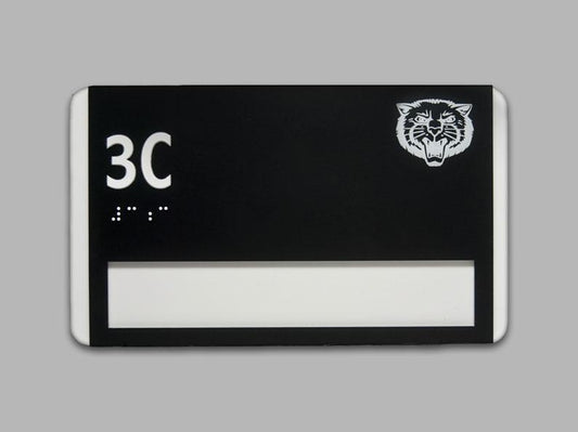
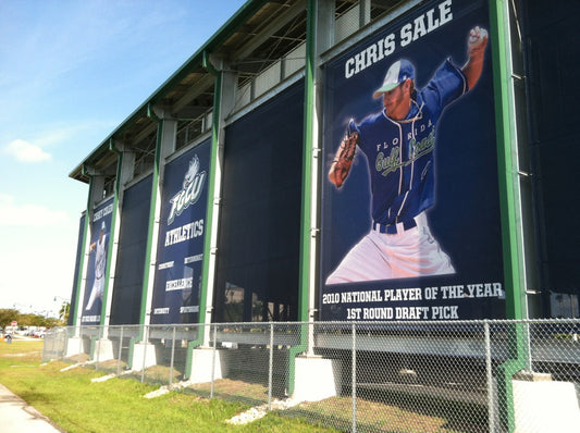
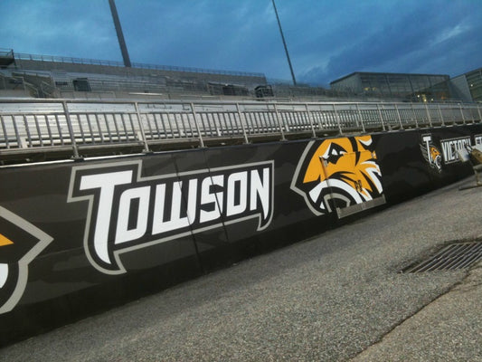
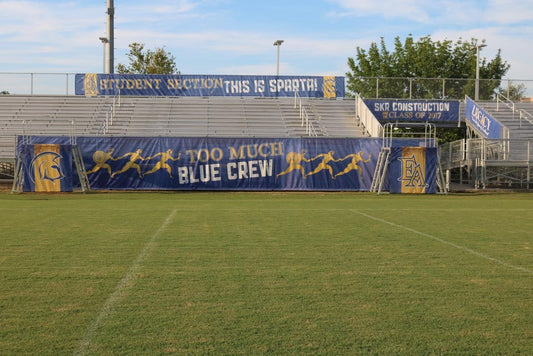
- Stadium Graphics
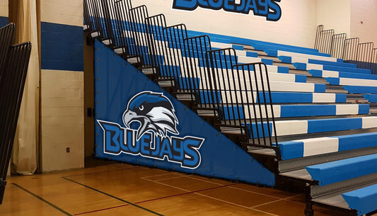
- Bleacher Graphics
- Scoreboard Graphics
- Concrete & Asphalt Decals
- Fence Screens & Windscreens
- Media Backdrops
- Pole Banners
- Sideline Signs
- Wall Graphics
- Barricades
- Hall Of Fame Areas
- On Deck Circles
- Pop Up Tents
- Bow Flags
- Window Graphics
- Wall Padding
- Champ Banners
- Sponsor Banners
Get a FREE Mockup & Quote
Or Call 800.790-7611
Our Product brands


Our Product brands


Let customers speak for us
Assistant Football Coach, Chowchilla High School
Corey I want to thank you for your patience throughout this entire process. You have been fantastic and I am extremely excited to see how these look. Thank you so much.
Weston Borba

BigSigns.com
Owner, Sauble Speedway
Mario, we used the banner as a backdrop for a trade show last weekend. It was a huge success!
Jason Thom
BigSigns.com
President, Tecumseh TD Club
I chose BigSigns.com because I was impressed that they have worked with major colleges all over the U.S., and their prices were very reasonable. I absolutely loved working with Mario in sales. I'll admit, I probably wasn't the easiest customer due to my indecisiveness, but he was incredibly patient and helped make the process smooth from start to finish. The team completely nailed our project, and I already recommended them to others. The final result over-exceeded my expectations. This was a big-time project for a smaller school, and my goal was to have people see it and be wowed. Mission accomplished!
Lance Phelps

BigSigns.com
Boys Varsity Volleyball Head Coach, Frontier High School
Ordered a door skin for our volleyball program. Customer service department was great ensuring the order was completed correctly in the end. Design team was accommodating with changes & requests to create a great final product!
Nicholas P.
BigSigns.com
Raton Tiger Booster Club
This is Stevie Medina with the Raton Tiger booster club over in Raton. I just wanted to say thank you for those on deck circles. They're amazing. We gave them out to the softball team and the baseball team. And they were super stoked to get them. They loved them. A lot of the kids like, what are those? Those are so cool. Those are so neat. So they really got a kick out of them. Appreciate you. How quickly you guys turn those around. Boy, we had them super fast. I just wanted to say thank you. Thank you much. And no need to return my phone call. I just wanted to let you know that we're enjoying them. And we appreciate all your help on it.
Stevie M.

BigSigns.com
Booster Club President, Blackwell Maroons Baseball and Softball
Just wanted to let you know HOW FANTASTIC the banner is. We have had so many compliments on this banner. Thank you!!!
Mark E.

BigSigns.com
Event Marketing Manager, Red Bull
BigSigns.com's ModStar gave us the ease of use, customization, and portability we needed. Modstar displayed sponsors for all seventeen nation-wide Game Breakers events; we are now repurposing the existing frames with new branding for our Copa-de-Calle events.
Jason H.

BigSigns.com
SVP, Competitor Group
Over 400,000 runners will cross a Rock n Roll Marathon or 1/2 Marathon finish line, all of them crossing a BigSigns GatorAd finish line, specially formulated as non-slip safe no matter the weather! Thank you, BigSigns!
Tracy S.

BigSigns.com
Booster Club President, Libertyville High School
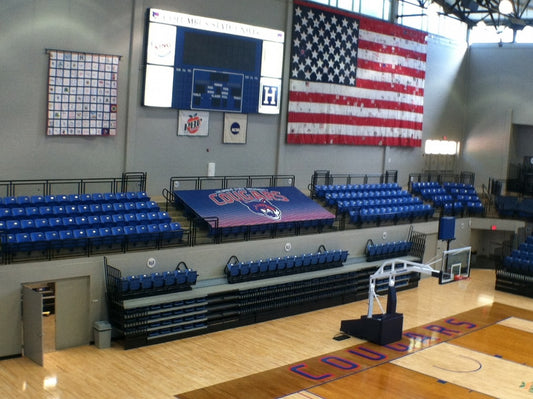
Let me start off by saying the signage is even more impressive in person than in your brochures or mock ups, which is hard to do. I love most everything about it. Also appreciate you guys busting your ass to get it done for our regionals tomorrow. You should feel free to use me as a reference if desired. The back of the scoreboard was done as well and looked fantastic. The back of the dugout was also done and looked great. Pretty impressive really. Thanks
Tom R.
BigSigns.com
Superintendent, Clarendon ISD
We received our step and repeat a couple of days ago and it turned out great!!!! Thank you for your patience working with me until I made a decision on a design. We actually took it to a job fair yesterday and had people comment on it. In fact, I just sent your contact information to a gentleman from Amherst ISD. His name is Jose Gonzales. I hope he contacts you because he seemed very interested. I will definitely refer others to you in the future as well. Once again, thank you for all you did for us. I know we will get many uses out of it.Thanks- Jarod
Jarod B.
BigSigns.com
Direct of Athletics, Tennessee Tech University
We have done business with you in the past and have been pleased with your work. I will stop by your booth if I have an opportunity.
Mark Wilson

BigSigns.com


